Fintech app · Cards · 2026
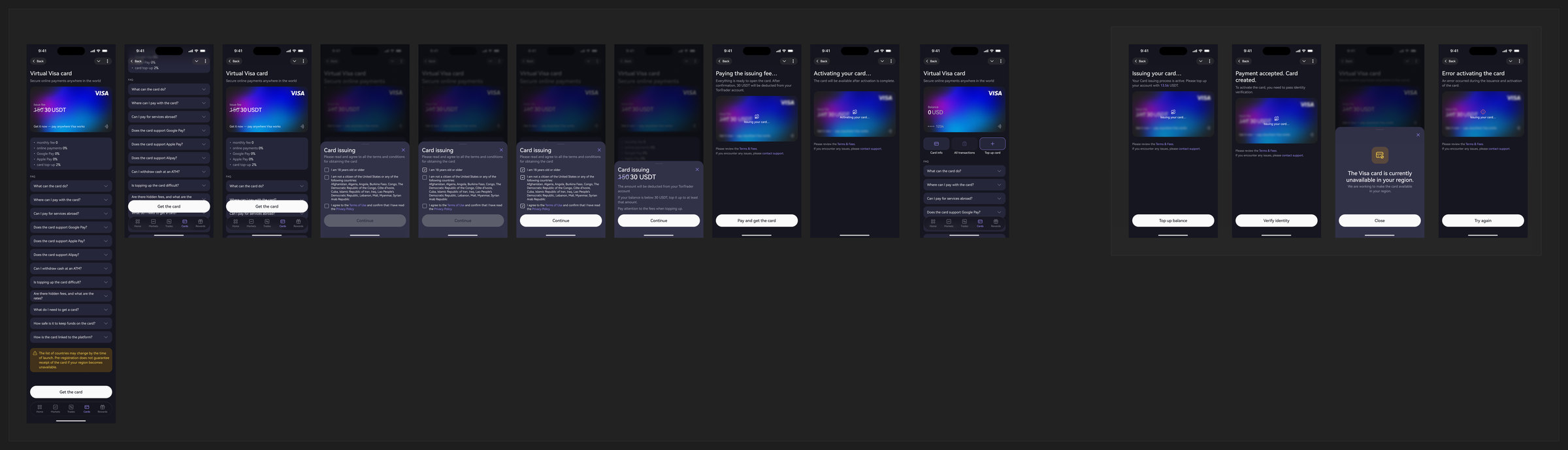
An issuing flow the user can abandon and resume — waiting on identity checks, deposits and a payment network, for as long as it takes.
The problem
Everything inside the app is balances and positions. A card is the first thing that leaves it — it has to work at a checkout, in a country with rules, on a payment network with requirements.
That turns issuing a card into something most product flows never have to handle: a process the user cannot finish in one sitting, and that waits on events outside the interface.
The core idea
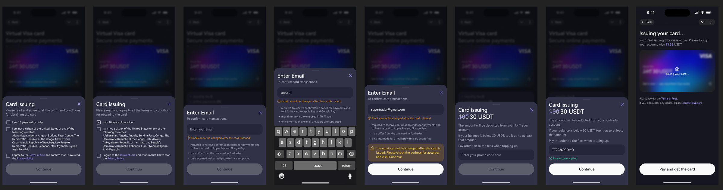
Issuing starts from the menu, from the home screen, or from a deep link. Along the way it can require identity verification or a deposit — and either can take the user five minutes or three weeks.
So instead of trapping the flow in a chain of modals, the card page itself changes according to the step: it waits for verification, or it waits for funding, and it says so. The user can close the app at any point and come back to a page that remembers where they stopped.

The rest of the surface
01 — Before issuing
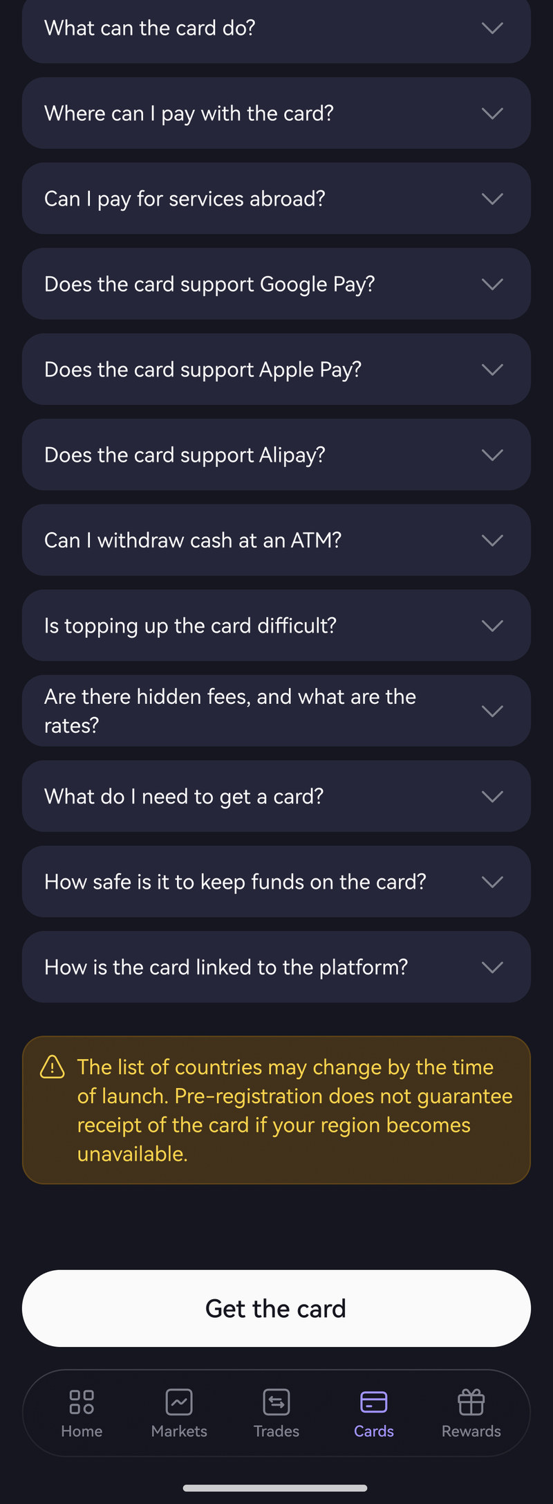
Before launch the card lived as a waiting list: what it is, where it works, what it costs at launch, and nine questions people actually ask — fees, top-ups, Apple Pay and Google Pay, ATM withdrawals, which countries. Plus the disclaimer that the country list may change, so pre-registration guarantees nothing.
02 — After issuing
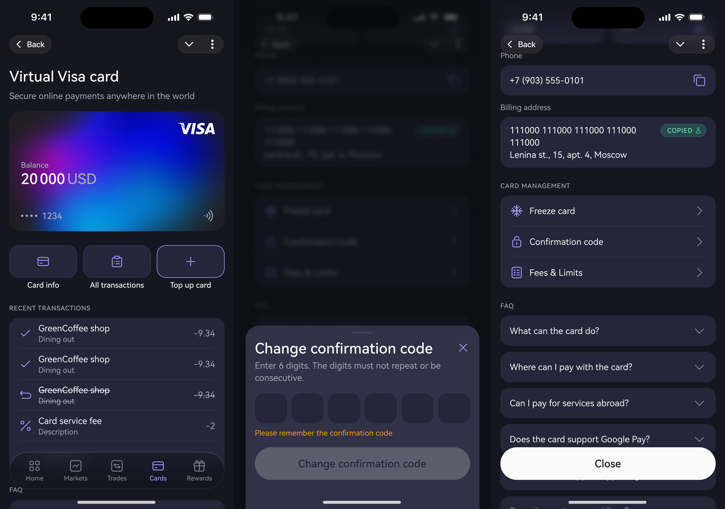
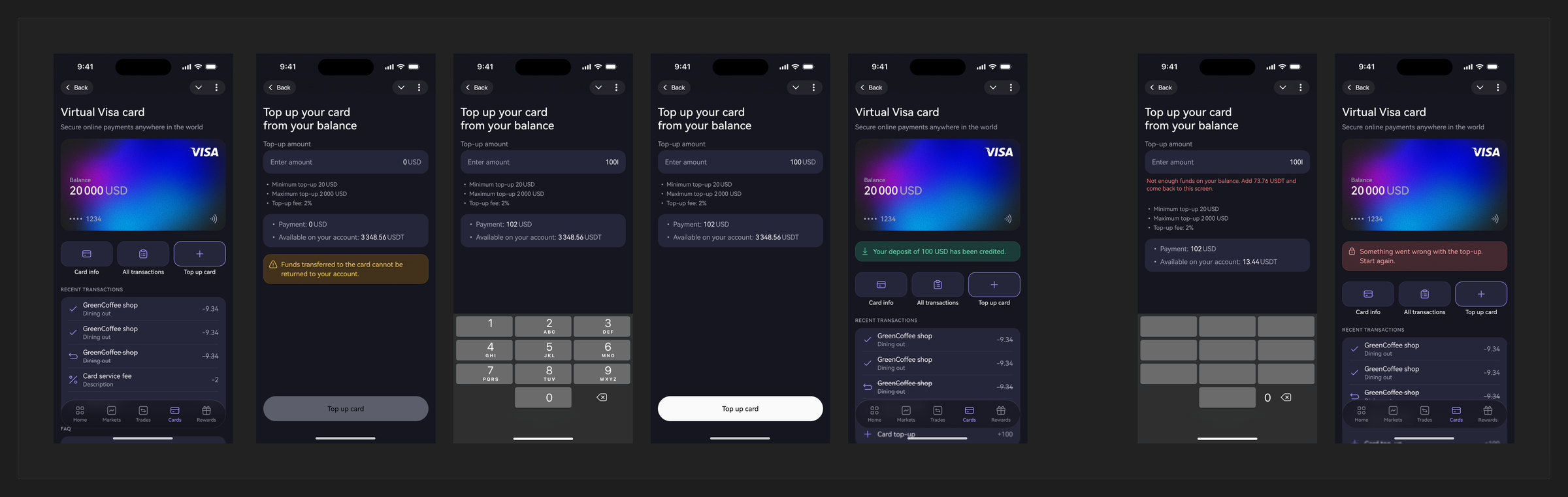
Once a card exists, it needs the unglamorous half: funding it from a crypto balance with a visible conversion, the record of what was spent, and the controls people reach for when something looks wrong.
03 — Craft
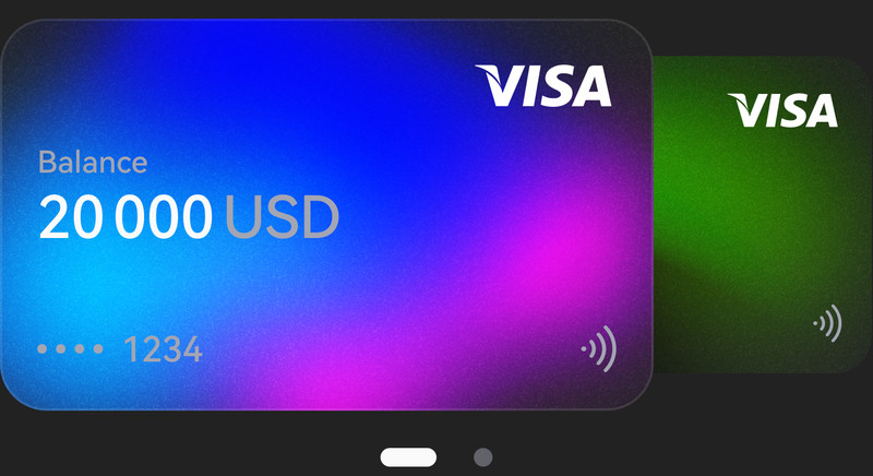
Card art needed motion — a carousel with a background animation. Rather than describing the behaviour in a comment, I built a working HTML prototype and attached a recording to the ticket, so the front-end could see the timing instead of interpreting adjectives.
04 — Second generation
The next iteration added promotional codes — which sounds like one input field and is in fact a new branch: a code can be invalid, expired, already used, or valid but not for this user. Each of those is a state on the same waiting page.
Where it went
The issuing flow shipped, the card tab was redesigned in the main wave, top-up got its own pass, and a second generation with promo codes is in review.
Alongside the product work I designed the campaign that sells it — five audience segments, and the constraint that the word “crypto” never appears in the copy.