How does a team keep shipping when the designer is away?
Migrating a fintech product from a style-based library to a tokenised design system — semantics the front-end can read, and a handoff the team runs on its own.
My role
Sole designer
Team
Product manager, front-end, QA
Client
Under NDA
Scope
Design system, six core flows, handoff
The problem
There was already a design system. It just couldn't be read by anything but a designer.
The product — trading, stocks, wallets, cards, deposits and rewards in one crypto app — had a library: paint styles, text styles, a shared component file. What it didn't have was a vocabulary. A colour was named after what it looked like, not what it was for. Nothing was aliased, so the same grey existed in a dozen places as a dozen independent decisions.
That works while one person holds the whole picture in their head. It breaks the moment someone else needs to ask for a value: a style has a name, but no meaning attached, so the front-end had nothing to map to code and every handoff turned into a conversation about hex codes.
And changing anything meant changing it everywhere by hand. A palette adjustment wasn't an edit — it was an audit. Meanwhile states drifted: the same status could look celebratory in one flow and alarming in another, because nothing had decided what the difference meant.
Part one · The migration
From styles to tokens — the same system, rebuilt so it can be read.
A style says what a thing looks like. A token says what a thing is for. The entire rebuild is that sentence, applied about a hundred and fifty times.
Primitives hold the raw ingredients — the palette, nothing semantic. Tokens carry meaning and are the only tier code ever reads: TEXT/primary, BORDER/tint-white, BG/canvas. Illustration stays apart, so decoration can change without touching the interface. Every token aliases a primitive instead of repeating its value.
The rule that follows: a component never references a primitive. Change the palette and the semantics hold — one edit instead of an audit. That constraint is what later let the team ship without me: nobody has to guess which grey was meant, because the grey has a job title.
Migrating an existing library is harder than starting from nothing. Every style had to be traced to real usage, mapped to a meaning, and replaced without breaking the layouts already built on it — which is where the mass renaming pass and the sweep afterwards came from.
148variables replacing loose styles — 100% documented, zero broken aliases
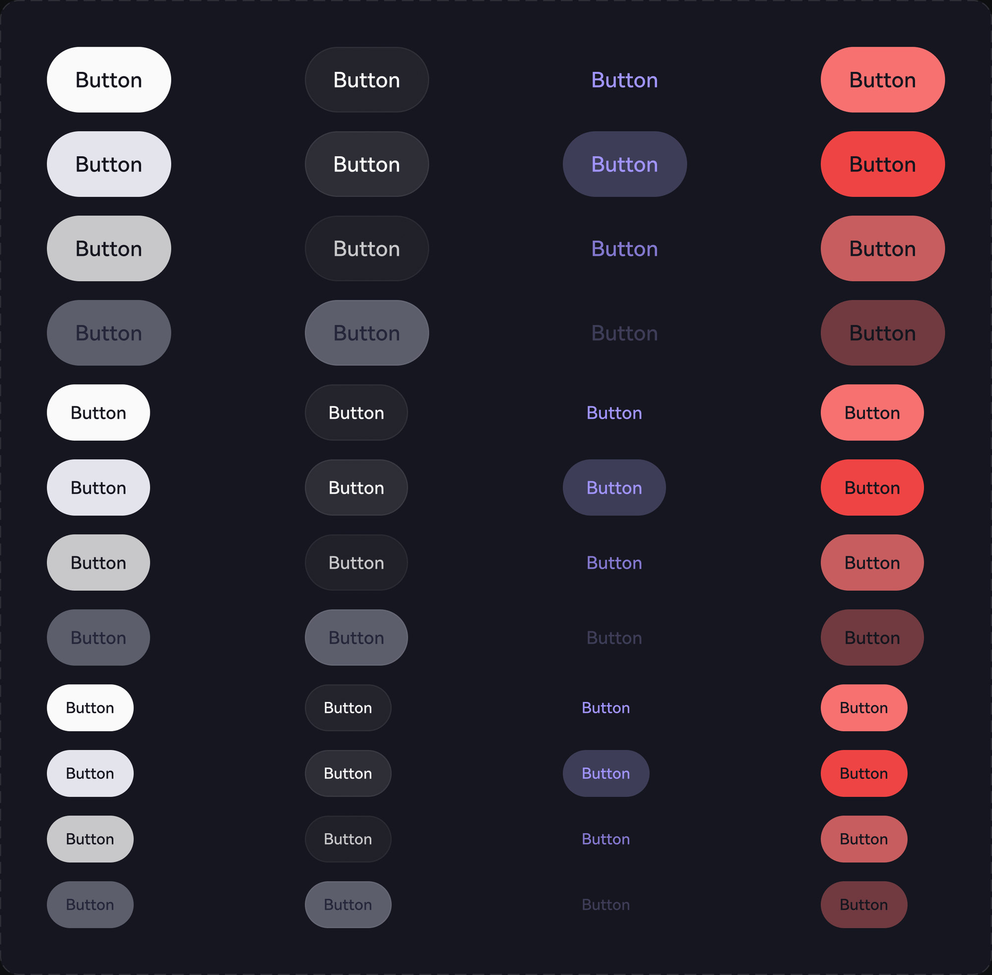
~50components rebuilt on tokens — Button alone in 48 variants
1364icons moved onto one token — colour survives a swap
AAcontrast across every key text pair
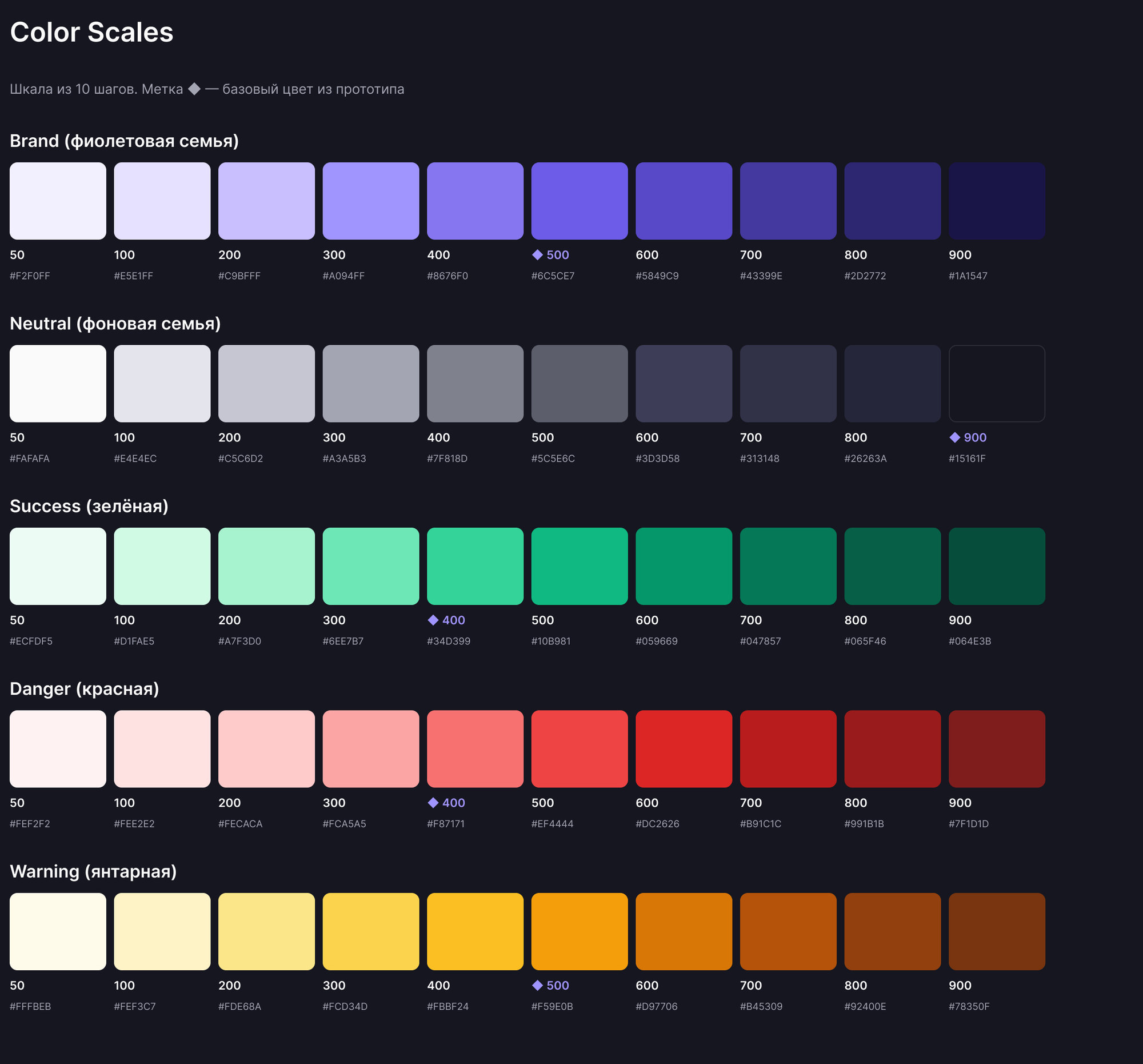
Fig. 01 — Primitives: five ten-step scales, the raw material no component may referenceFig. 02 — One component, forty-eight variants: type × size × state, every value a token
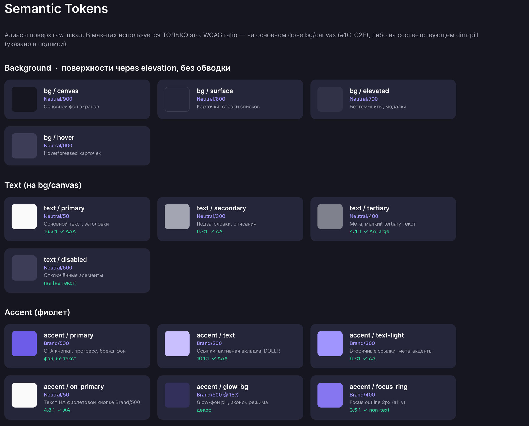
Fig. 03 — The semantic layer: every token an alias, with its contrast ratio attached to it
Part two · Five decisions
Every rule in the system exists because something broke first.
01 — Disabled
Opacity is not a state
A screenshot from testing showed content scrolling through a fixed call-to-action. The disabled style used 40% opacity, so the page underneath was visible straight through the button.
Before
Disabled = 40% opacity, applied globally. Transparent by definition, so anything behind it showed through.
After
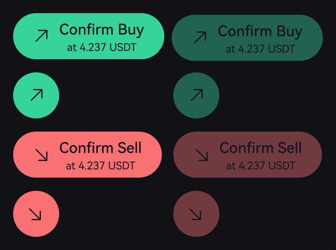
Five opaque disabled tokens, computed as composites. #216250 is Success/400 at 40% over canvas — identical appearance, nothing behind it visible.
The mathematics had a quiet gift in it: the text colour on coloured disabled buttons needed no new token. On-light equals N900, which equals canvas — at 40% it rendered as exactly the same colour it was already meant to be.
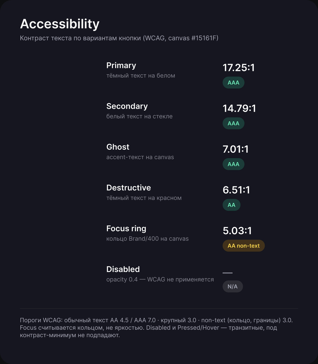
Fig. 04 — The fixed call-to-action, enabled and disabled. The disabled fill is opaque, not see-throughFig. 05 — Contrast measured per variant; disabled sits outside the thresholds on purpose
02 — Borders
Three borders into one hairline
The manager's feedback was blunt: remove the borders. Three different border tokens were in use — chip at 12%, glass at 14%, divider at 6%.
The request
“Remove the borders” — they read as noise across dense trading screens.
The decision
Not removed, collapsed. One BORDER/tint-white at 6%, almost invisible. Depth now comes from background steps: canvas → surface → elevated.
The system has no shadows at all. Elevation is expressed by ground, not by blur — which also means it survives a dark interface without a second set of tokens.
03 — Components
A component has to express the domain
Trades carried a single property called Direction, with values Up and Down. It quietly conflated two different things: the side of the trade, and the sign of the profit.
Which made one very ordinary situation impossible to build: a long position that is currently losing money. Half of a trader's life, and the component couldn't say it.
Before
Direction: Up / Down — one axis doing two jobs.
After
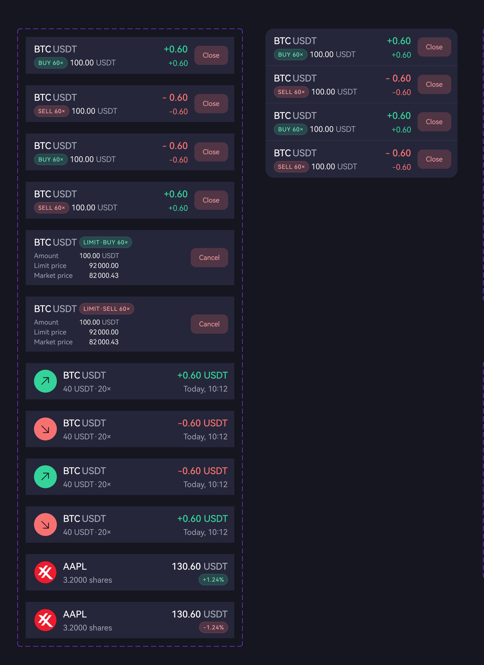
Two independent axes, side × P&L, applied across Trades, positionCard and positionInfo.
Fig. 06 — Side and profit as two axes: a long position losing money is now expressible
04 — Status
One shape, two tiers
Success and closure shared an illustration — coins, a shield, stars — and were distinguished only by a 20px badge. Worse, the shield carried its own meaning elsewhere in the product, where it belongs to identity verification.
Before
Different shapes across flows; opposite meanings sharing one image; a symbol borrowed from KYC.
After
One rounded square. Glow means celebration — mint success, violet product, coral reward, gold achievement. Flat means attention — danger blocks, warning delays.
Glow is the tier, colour and glyph are the meaning. Two variables instead of a growing pile of bespoke illustrations.
05 — Consistency
Ninety arrows, four sources
A direction arrow kept going the wrong way — a Sell badge showing an up arrow. It had been caught twice by eye, which meant it would be caught a third time.
The reason was structural: the arrow was a character typed into the label, so every copy of a Buy badge into a Sell one carried the wrong glyph. A sweep found 90 text arrows across the files, coming from only four sources — three masters and one override pattern.
Before
Arrow as a character inside the text. Invisible to the system, impossible to validate, lost on every copy-paste.
After
Arrow as an icon bound to the variant. Fixing three masters resolved about 70 of the 90 instances at once; the rest were listed for manual cleanup.
If a symbol carries meaning, it belongs to the component — not to the copy. Anything typed by hand will eventually be typed wrong.
06 — Handoff
Holiday engineering
Before three weeks away I built the thing I actually wanted to test: a system that runs without me. A sandbox page with three lanes — inbox, work in progress, to review — freeze rules for the design system, handoff frames carrying behaviour and formats, and two custom assistants so the manager could brief drafts and run reviews on his own.
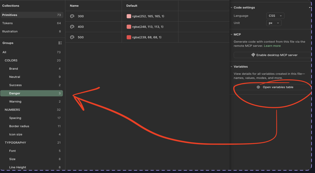
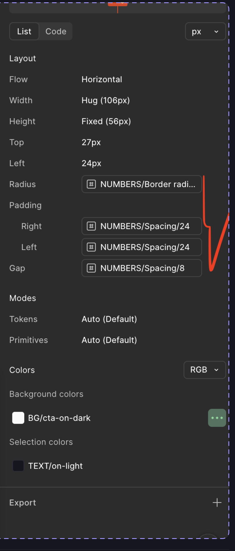
Fig. 07 — The variables table the team opens instead of asking a designer for a hex codeFig. 08 — Inspect returns token names, not values: NUMBERS/Spacing/24, BG/cta-on-dark
Review
In fintech, reviewing a screen means reviewing the arithmetic.
A design review here isn't only about spacing. When a position reverses from long to short at the same price, the entry price becomes the new one, profit and loss resets to zero at that moment — the sign changed, not the amount — and the liquidation price moves above the entry instead of below it, because the direction flipped.
Screens arrive with numbers that look plausible and aren't. Catching that is part of the job: a mock-up with impossible arithmetic will be built as specified, and the error surfaces later as a bug report from a user watching real money.
The same applies to typography that carries meaning — a hyphen standing in for a minus sign in a P&L value is not a detail, it's a different character in a number people read to decide whether to sell.
What didn't work
Three failures that turned into rules
The library stopped publishing, silently. Publish ran, nothing updated. The cause turned out to be a validation error — orphaned properties left behind after restructuring — reported in a place nobody looks. Lesson: Figma will block a publish without telling you why in the place you're working.
Texts dropped when a mode was selected. Option Row lost its labels the moment a variant switched to “on”. The diagnosis: text properties were bound only in the off variants, so the on state fell back to whatever the master held. Nine bindings fixed it, and it became a rule I now check first — if content disappears on variant switch, look at bindings in every variant, not just the default.
131 coins invisible to the team. Every crypto icon was in the file, but none appeared in the library. Two variants had been named outside the property=value scheme, which put the entire set into an error state — and Figma won't publish a set with errors. One malformed icon was hiding a hundred and thirty healthy ones.
The test
Three weeks away, and the product kept moving.
The holiday was accidental proof. While I was gone, the front-end built and closed two major flows — the trading experience and the home screen. QA reviewed the build against component documentation and found around eight defects, all fixed without a designer in the loop.
Two decisions were taken without me as well. Both needed adjusting on return — but they were decisions, not blockers. The product didn't wait.
Two flows shippedTrading and home, built and closed with no designer involved
~8 defects caughtQA reviewed against documentation, not against a person
Zero blocked ticketsOpen questions became decisions to revisit, not stop-work
Voices
“Always ready for a deep dive into the technical side of projects — open to finding the balance between a designer's imagination and the harsh reality of development.”
Alex Trutanov · Lead Frontend Developer
One question from the front-end turned into a system rule. He asked how the interface should show unseen items — and the answer became a convention: a red dot means something new arrived and never dims; a counter badge means how many there are in total and follows the rules of its tab. Two different jobs, two different marks.
Reflection
What I'd do differently
Migrate in public. Moving from styles to tokens changes how everyone asks for things, not just how the file is built. I announced the architecture once and assumed it landed — in practice the vocabulary only stuck after it appeared in handoff docs and component descriptions people actually open.
Mark agreed versions on the canvas. Two generations of frames lived side by side, and the front-end argued against a layout that had already been superseded — not because anyone was careless, but because nothing on the canvas said “this one is agreed”.
Write empty states into handoff explicitly. The decisions taken in my absence were both about states I hadn't documented — what the home screen shows when there are no active trades, for instance. The system covered components thoroughly and situations less so.
On working with AI. It audited 148 variables and ~50 components in minutes, assembled draft screens from the library in about two, and computed contrast ratios as arithmetic rather than guesswork. It also once answered a ticket in my name with two factual errors in it. The rule I keep now: it does volume, I do judgement, and nothing leaves for a human without me reading it first.