Anastasiya Rubanova Get in touch

XCOEX · Website · 2022

Why should a form behave the same way on every screen?

A crypto exchange website rebuilt as a component library — every element in desktop, tablet and mobile, every form state designed.

My role
Sole designer — everything except the logo
Company
XCOEX
Breakpoints
Desktop, tablet, mobile
Scope
Component library, registration, blog

The problem

A form is where a product first asks for something.

Everything before sign-up is marketing. The registration form is the first moment the product makes a demand — an email, a password, a country — and the first moment it can lose someone.

The site had a form on desktop and a different form on mobile: not different layouts of one thing, but two designs that had drifted apart.

The approach

Not pages — a component library with states.

I rebuilt the site as a set of components, each existing in desktop, tablet and mobile versions from the start: news and blog cards, video cards, breadcrumbs, tags, testimonials, headers in three sizes, and a country selector with availability states plus its own disclaimer colours for light and dark grounds.

Everything except the logo is mine — there was no second designer on this site.
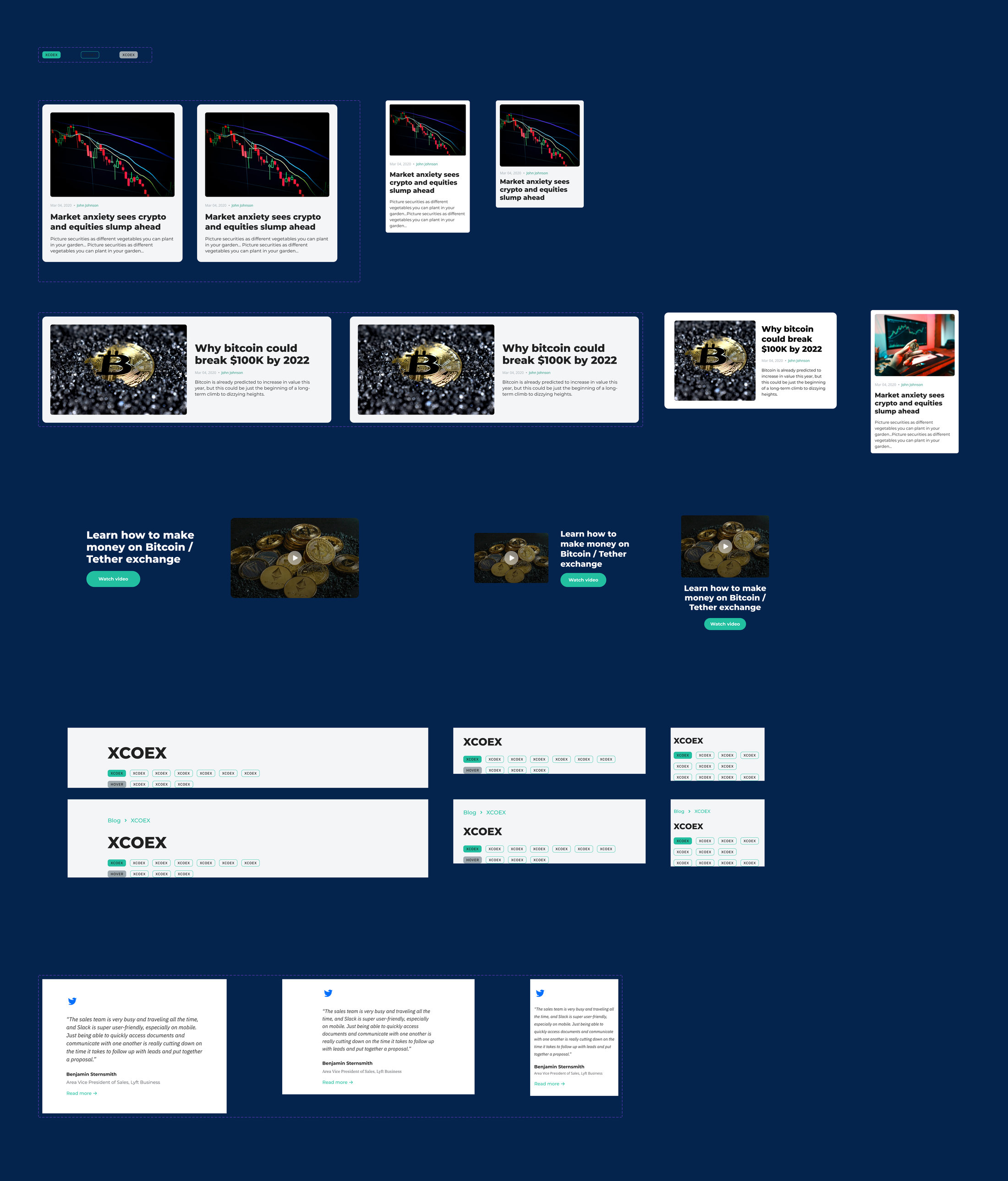
Fig. 01 — The library: news, video, headers, breadcrumbs, tags and testimonials — each at three widths
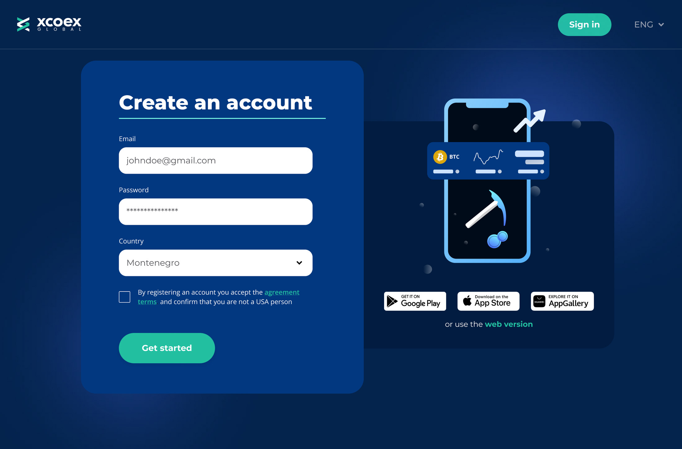
Fig. 02 — Registration on desktop, assembled from those components

The form

Every state, drawn on purpose

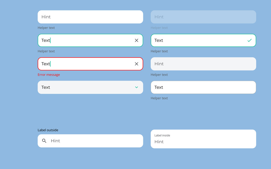
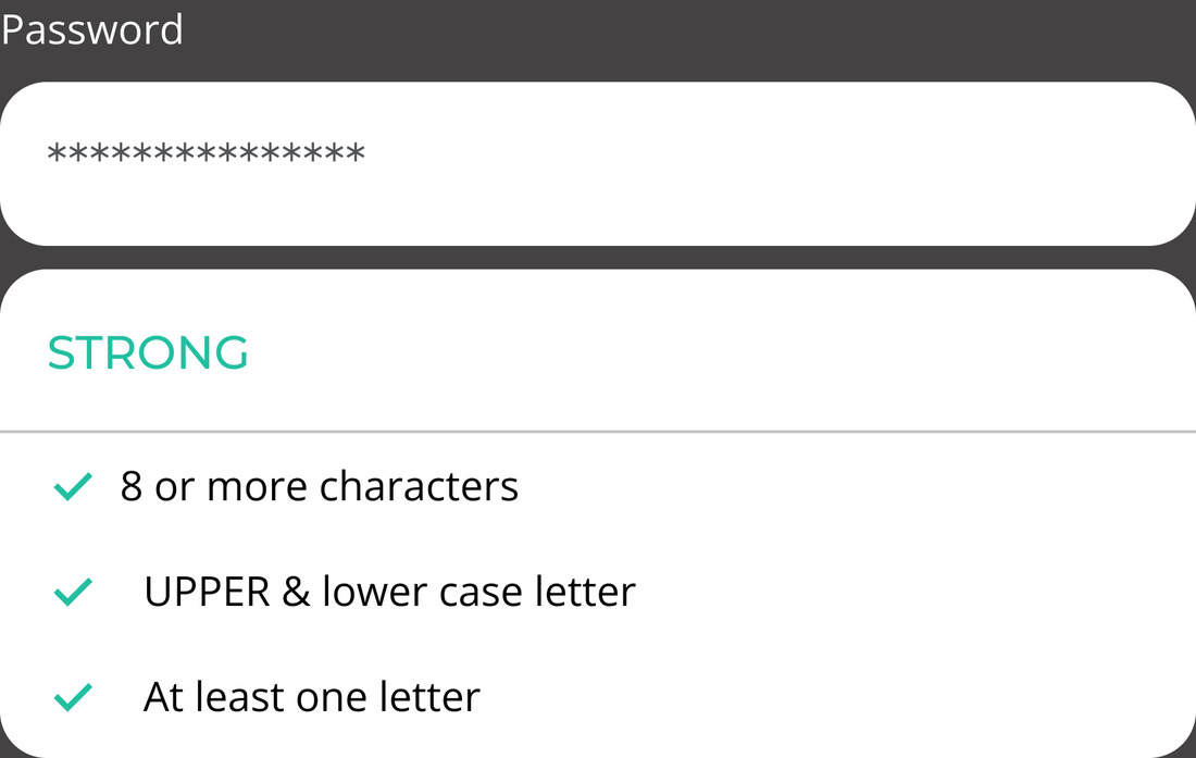
Fields exist in hint, helper, error, success and disabled. The password field shows strength in three levels with the criteria listed, so the rule is visible before it's broken rather than after. The country field has search, because the list is two hundred entries long and scrolling it is not a design.

App store badges include AppGallery alongside Google Play and the App Store — the audience wasn't only on Google's side of the world.

Fig. 03 — Field states drawn once
Fig. 03 — Every field state drawn once: hint, helper, focus, success, error, disabled
Fig. 04 — Password strength
Fig. 04 — Password strength with the rule visible before it is broken
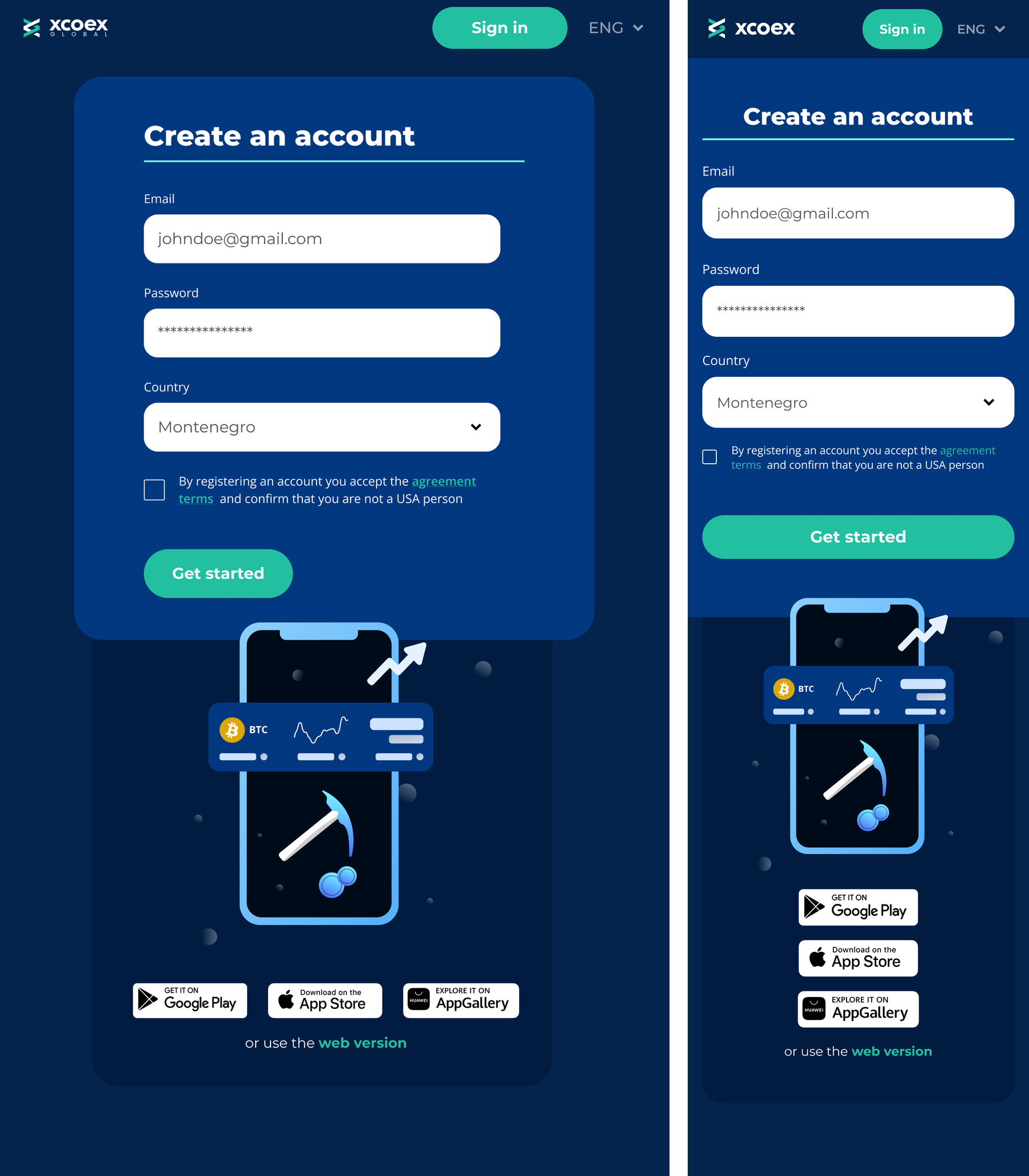
Fig. 05 — The same form at 768 and 375 — one component, three widths, no second design
Before

Desktop and mobile forms designed separately; states improvised per screen.

After

One component with defined states, laid out for three widths.

Why it's still here

This is 2022 — and that's the point.

The product has since been sold, so there's no live link and no “after” to visit. What the work shows is that the systematic approach in my current case isn't a recent conversion: two years before building a design system, I was already treating a website as components with states rather than as pages.