What happens between tapping Buy and seeing your position?
Redrawing the whole trading path as one sequence — instruments, asset, order, position, history — plus the money moving in and out around it.
My role
Sole designer
Team
Product manager, front-end, QA
Client
Under NDA
Scope
16 shipped tickets, one redesign wave
The problem
A trade is six screens, and every one of them can go wrong.
Buying looks like one tap. Underneath it there's a list of instruments, an asset page, a configuration sheet, a confirmation, an open position that changes every second, and a record of what happened after it closed.
Before the redesign these lived as separate screens drawn at separate times. The same value — the direction of a trade, the sign of profit, the state of an order — looked different depending on where you met it. The path existed, but it wasn't designed as a path.
The path
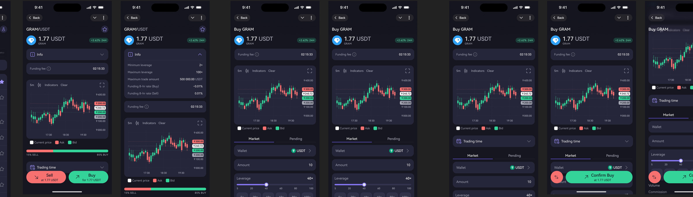
Markets → asset → configure → confirm → position → history
I redrew the whole sequence as one continuous flow rather than as a set of screens, and set rules that hold at every step: the same badge means the same thing, the same number is formatted the same way, and every state that can occur is drawn — not only the one where everything works.
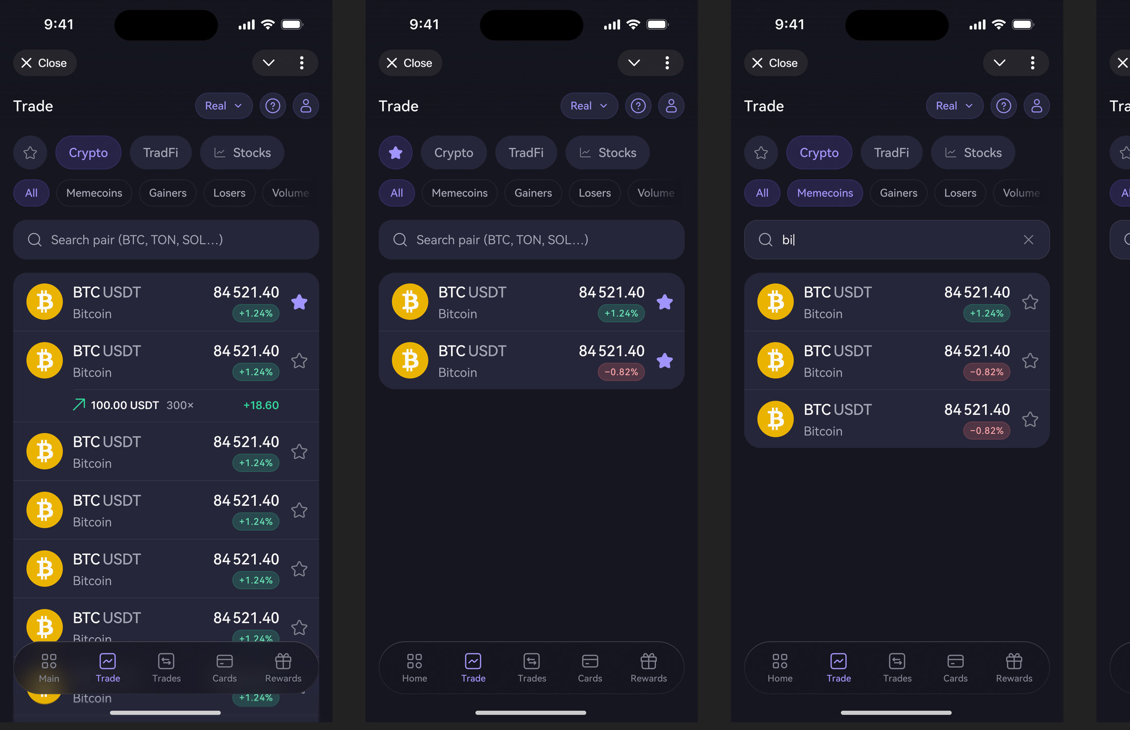
Fig. 01 — Markets: crypto, CFDs and tokenised stocks under one screenFig. 02 — The path itself: asset, configuration, confirmation, open position
Four decisions
What the path forced me to change
01 — Instruments
Three product rails under one screen
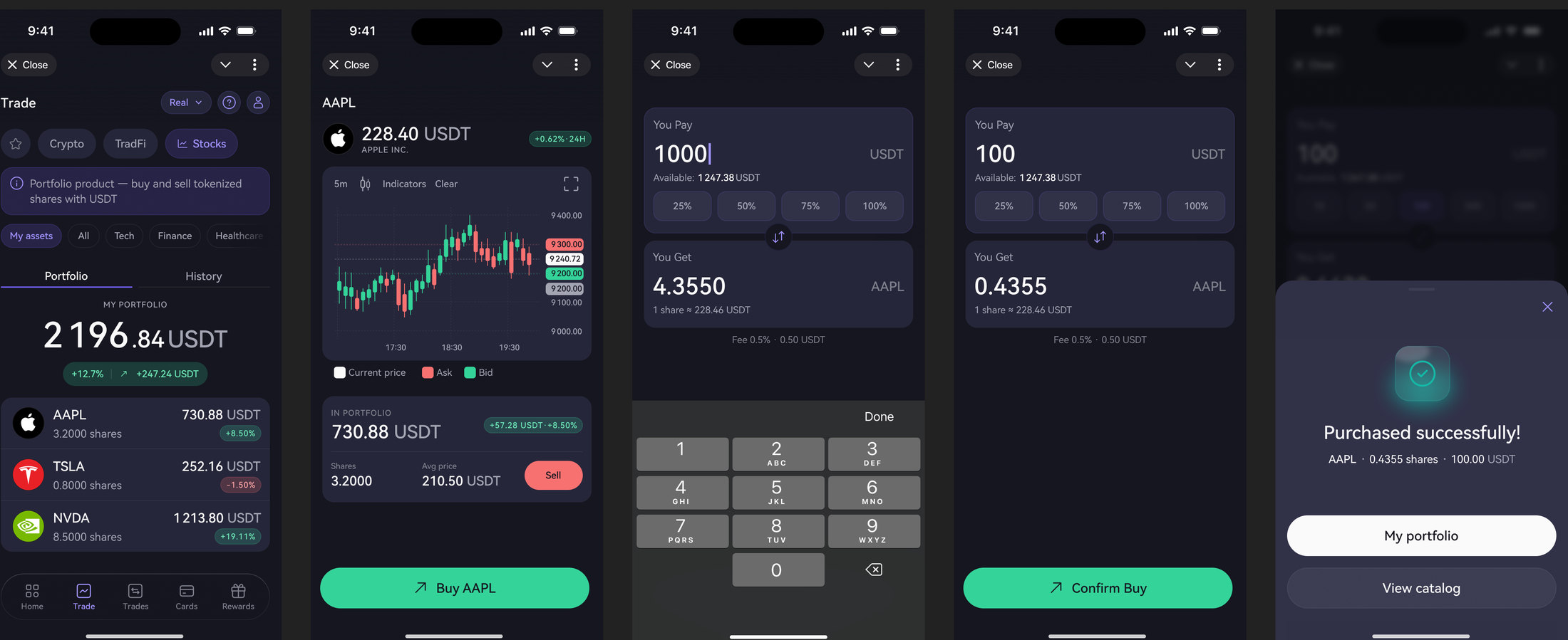
Crypto, traditional markets as CFDs, and tokenized stocks are different products with different rules — trading hours, leverage, availability. They share one tab.
Rather than three separate screens, the list carries the difference: market hours where they apply, groups for currencies, metals, indices and commodities, and instrument icons drawn as a set so a new asset never arrives as a stranger.
Fig. 03 — Tokenised stocks: a different asset class inside the same buying flow
02 — Position
A component has to express the domain
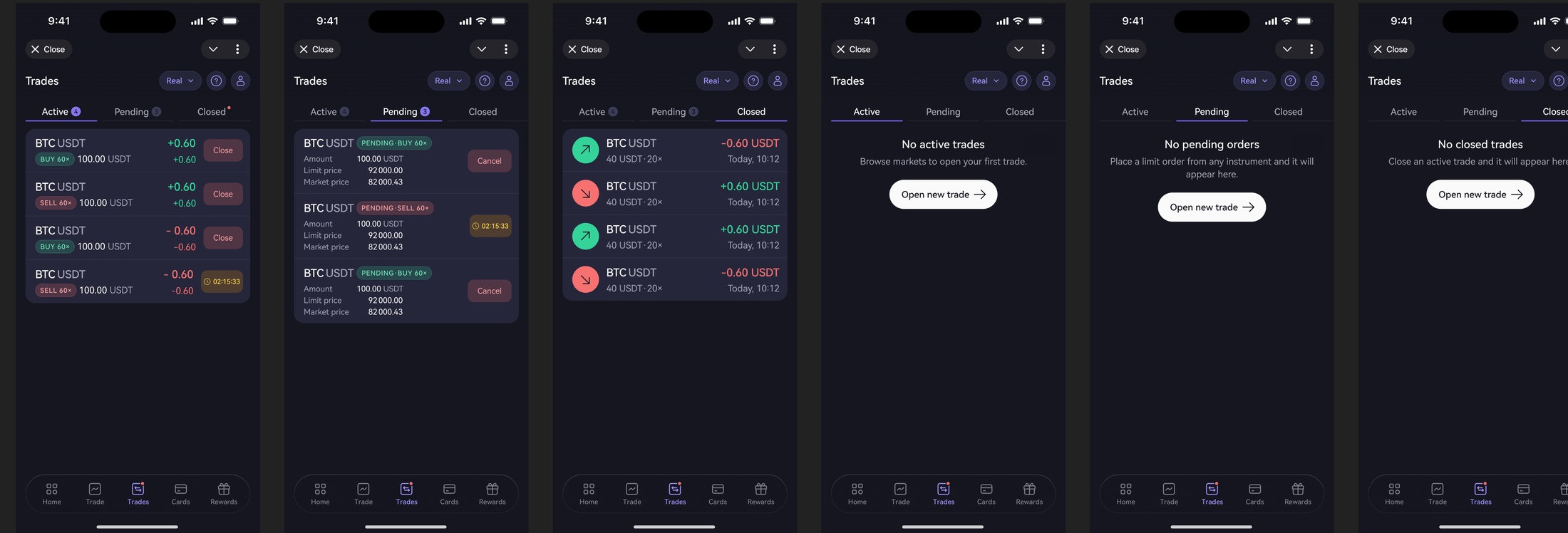
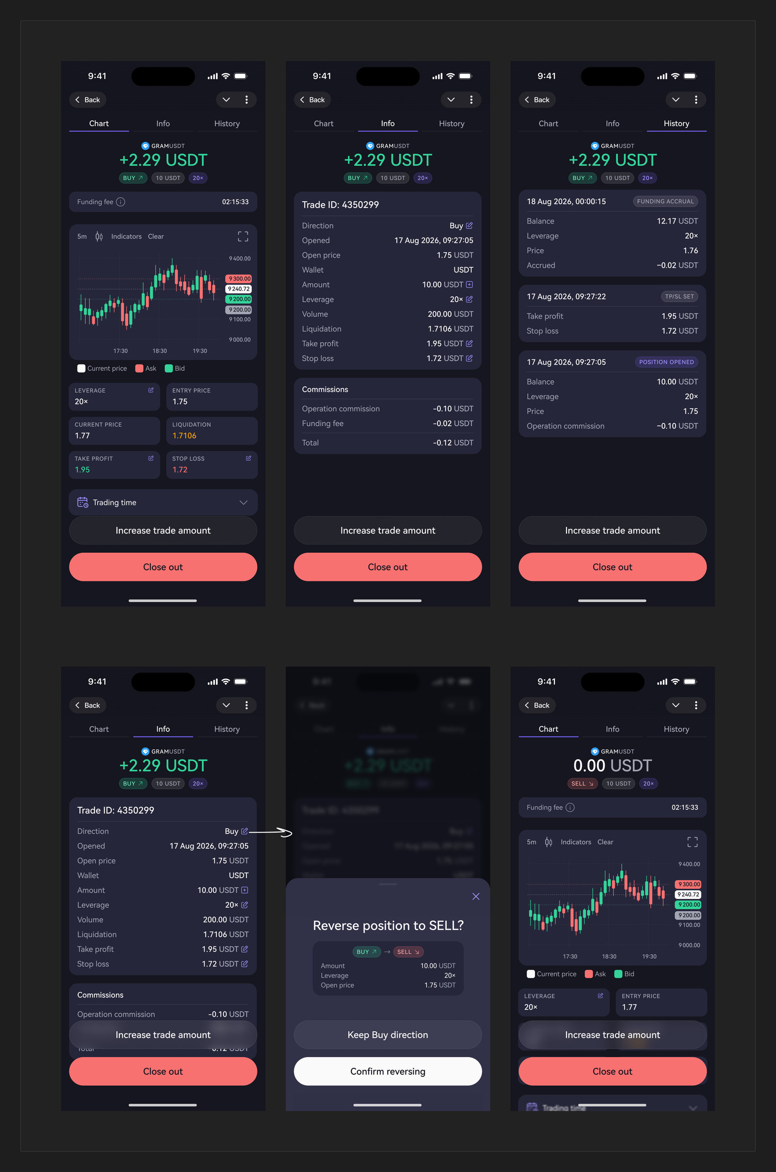
Trades carried one property, Direction, with values Up and Down — quietly conflating the side of the trade with the sign of the profit. Which made a very ordinary situation impossible to build: a long position that is currently losing money.
Before
Direction: Up / Down. One axis doing two jobs.
After
Two independent axes — side × P&L — across the trade list, the position card and the position detail.
Fig. 04 — Trades: active, pending and closed — each with the empty state nobody drawsFig. 05 — Position detail: chart, terms and history, and reversing a position from buy to sell
03 — Money in and out
Deposit and withdrawal are part of trading
Most trading redesigns stop at the chart. But a first deposit is where people decide whether to trust the product, and a first withdrawal is where they find out whether it was true.
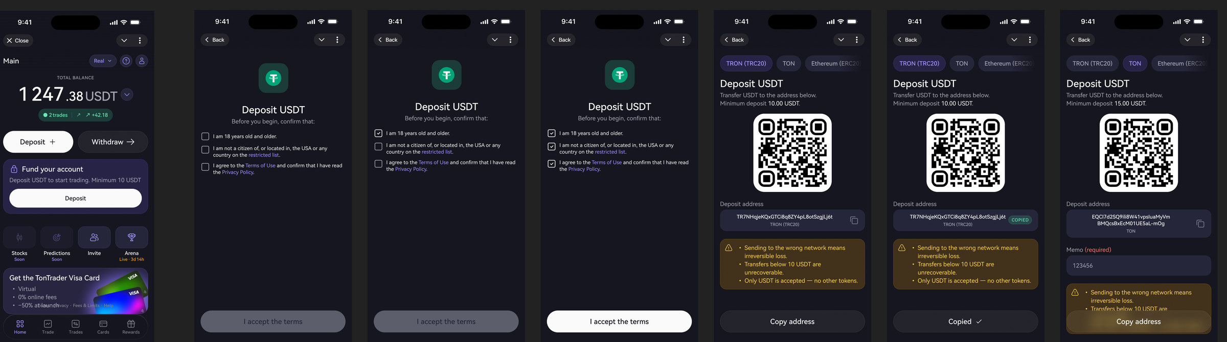
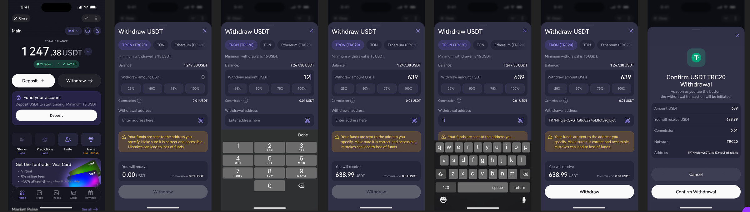
Both flows were rebuilt in the same wave as the trading path — including identity checks, enforced two-factor before a first withdrawal, and the waiting states in between.
Fig. 06 — Deposit: terms accepted, network chosen, address copied — warnings where the money isFig. 07 — Withdrawal: amount, address, commission, and an explicit confirmation before funds leave
04 — The gate
The screen you design for people you must turn away
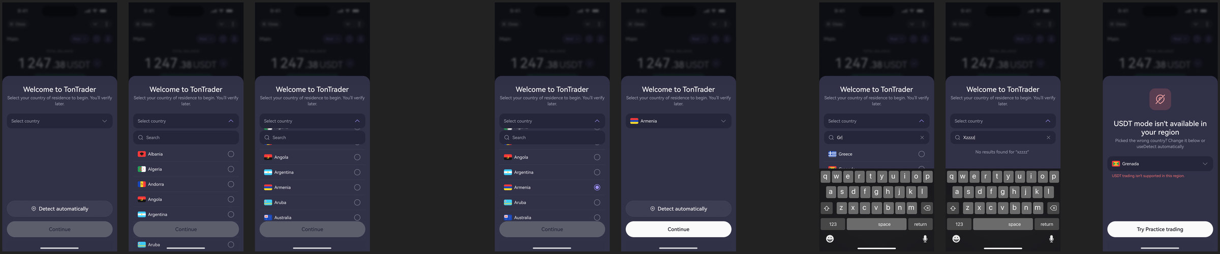
Residency rules decide who may trade in which mode. That's a legal boundary, but it lands on a person who just wanted to open an app — so the country gate had to explain rather than block, and behave predictably when someone's residency changes.
An unavoidable no should still be a designed screen. The alternative is an error message, and an error message is what people screenshot for support.
Fig. 08 — The gate: pick a country, search it, find nothing — and the region that may only practise
Scope
Sixteen shipped tickets in one redesign wave.
Home · Markets · Trades · open and closed position detail with leverage and amount modals · deposit · withdrawal · country gate · market pulse · invite · mode switch · profile · tab bar · tokenized stocks · asset header · info block · limit orders.
All of them assembled from the same component library, which is why one designer could carry a wave this size — and why the front-end could build two of these flows while I was away.
Reflection
What I'd do differently
Mark the agreed version on the canvas. Two generations of frames lived side by side, and the front-end argued against a layout that had already been superseded — nothing said which one was final.
Document empty states as explicitly as components. The decisions taken without me were all about situations I hadn't drawn: what home shows when there are no active trades, for instance.